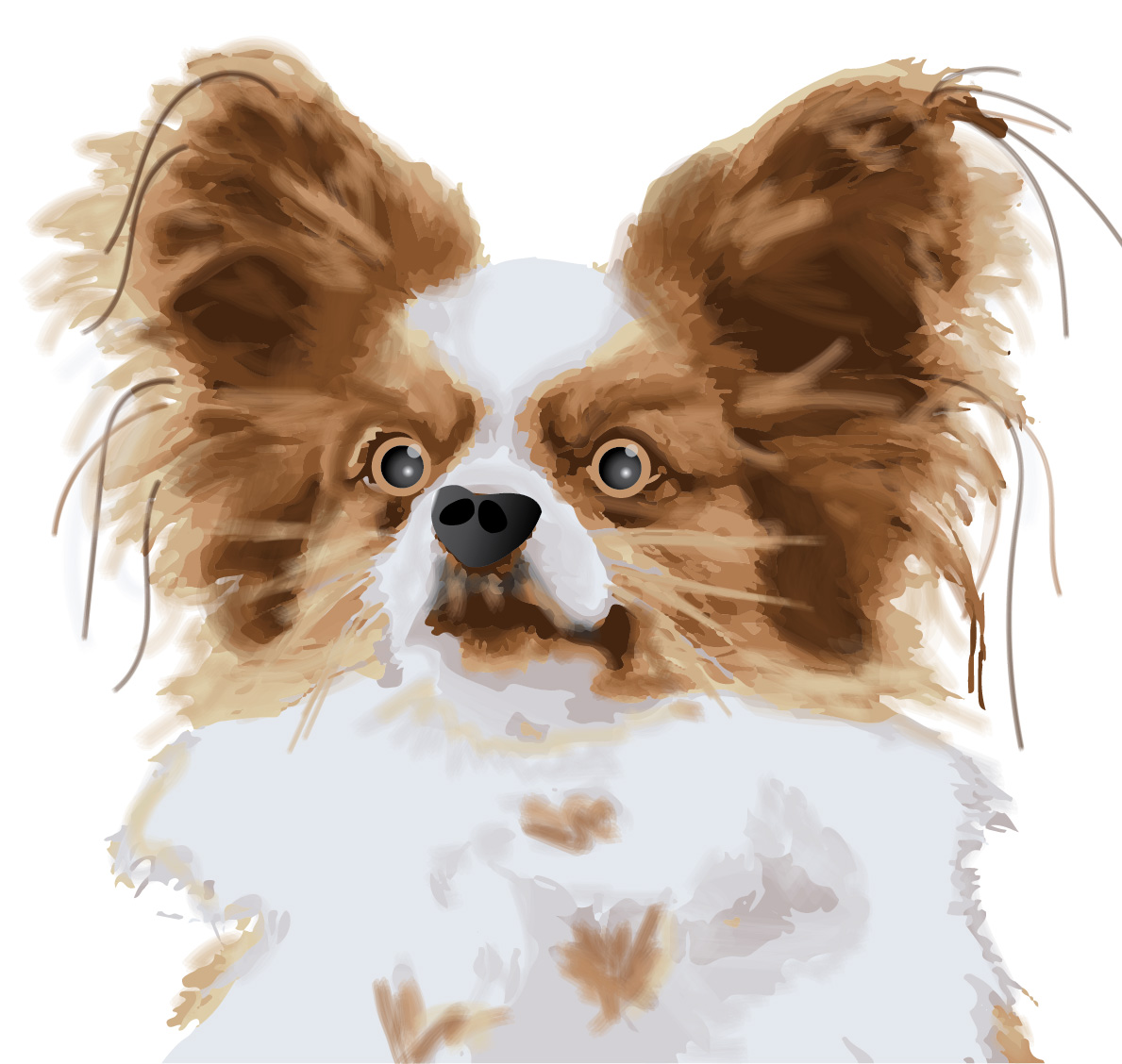
The main tool used in creating this dog was the Image Trace Tool.
Once the image is placed on the art board, select “Image Trace” > “16 Colors.” The image becomes digitalized.
Then use the command “Object” > “Expand” and “Object” > “Ungroup” in order to delete the background and manipulate each piece of the dog separately.
An important tool to use to delete the background (or change colors to match other colors on the image) is the command “Select” > “Same” > “Fill and Stroke.”
For the rest of the dog, I created swatches from the original image then used the paintbrush tool the make it appear more “fuzzy.”
The paintbrush tool can be changed to different strokes and opacities, which adds layer and depth to the dog.
I then created a new nose for the dog using the pen tool and the gradient tool.
Lastly, I created new eyes for the dog using the ellipse tool and the gradient tool.
The main tool used to create this city was the perspective grid tool. It is important to leave the grid in it’s place one you determine the size grid you want to use.
The small 3 dimensional cube at the top of the screen helps navigate the perspective grid. Each side of the cube relates to a side of the perspective, and that side has to be clicked before making any rectangle on the area of the grid you would like to work in.
Use rectangles to form the buildings. As you drag the rectangle, it will automatically become proportional to the perspective of the grid.
To add text (or any other object into the perspective grid), use the Perspective Selection Tool and drag the object into the grid. It will the become part of the perspective scene.
Once I finished creating the city in perspective, I copied and pasted the whole city and reflected it across the page. Then I manipulated the colors to make it appear as a whole different building complex.
Lastly, I added two large rectangles, sent them to the back, and added gradients to each of them.
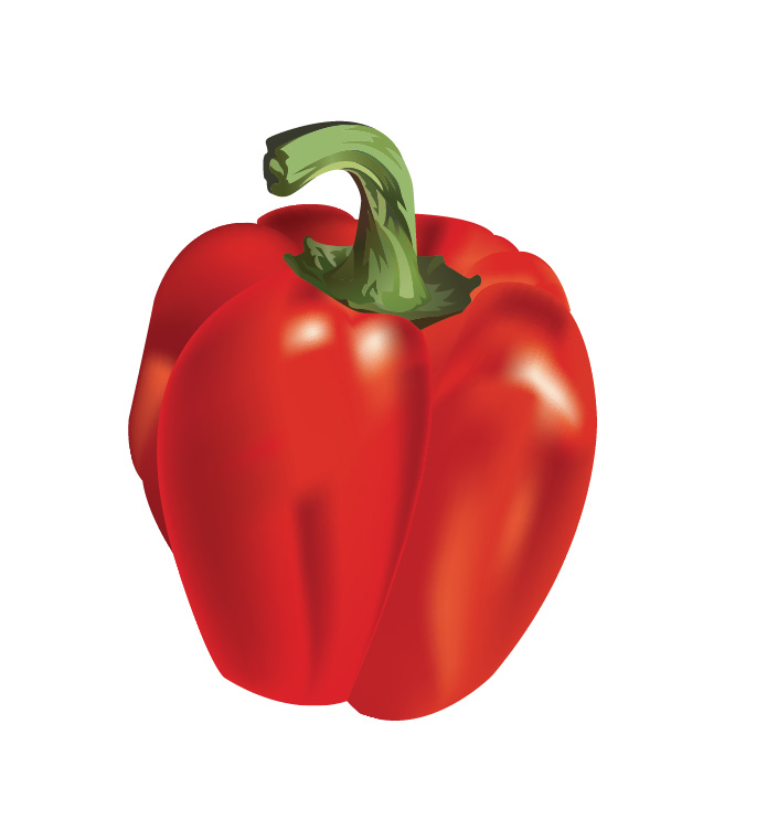
I used the gradient mesh tool to color each piece of the pepper separately. To begin using the tool, you click anywhere in the pepper that needs a gradient added. This created a grid on the pepper, splitting it up into areas that different colors of gradient can be added.
I started with the white glares on the pepper. If the gradient section is too large and the color extends further than you would like, you can keep adding more lines in the mesh grid which cuts off the color of gradient.
It is important to note that the direct selection tool can be used to manipulate the anchor points on the gradient mesh grid to make the areas of gradient smaller or larger.
Another tool that is helpful is to use the direct selection tool to drag across many points, which allows gradient color to be added to a larger section of the object.
This is a tricky tool, but I learned that it takes lots of time and attention to detail to create a gradient that looks realistic.
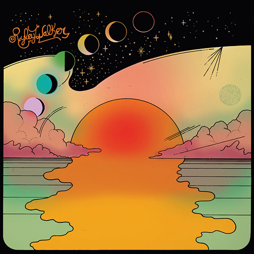
This is Ryley Walker’s album cover for “Golden Sings That Have Been Sung,” which was released in 2016. It features a nature scene including different layers of the atmosphere, such as the ocean, the sun, the clouds, and outer space. The album cover portrays the music accurately, since the music is laid back and retro.
What do you think was used to create it?
I believe this album cover was created in Illustrator, since it has a very hand-made and graphic appearance. The artist did not use any real-life images; he created this piece from scratch using tools in Illustrator. I think there was heavy use of the pen tool, seen in the outlines of the sun and the clouds, which gives it a hand-drawn, authentic feeling. The gradient mesh tool was definitely used to create the gradient in the sun, the clouds and the sky, which gives more depth to the graphic. It looks like the ellipse tool combined with the pathfinder tool was used to create the moon shapes that lead the eye to the top of the album cover.
What design elements do you see?
Contrast
There is a definite contrast between the black outer space and the light pastel colors of the sky, which makes the artist’s name stand out. Also, the bright orange stands out among the neutral sky and clouds.
Movement
This scene has a lot of movement within the sun that appears to pour over the ocean. It leads the eye from the bottom of the graphic up to the artist’s name at the top, with the moon shapes transforming as they lift upward. The gradient also gives this graphic movement and depth within the images.
First I outlined the half of the original wine glass with the pen tool, then I copy & pasted and reflected it so the that I would have a symmetrical glass.
I used pathfinder quite a bit to create the small lines on the edges of the glass. I would overlap two full wine glasses and only select the small part showing behind the top glass.
The main tool of this assignment was the gradient tool, which I used for the glass, the wine, the stem, and the accents on the bottom. It is important to use the eyedropper to grab colors from the original image and save those colors to “swatches” by creating a new swatch. Then these new swatches can be used to create accurate gradients.
Double click on the gradient scale to add a new color to the gradient. Drag back and forth to adjust the darkness and lightness of the gradient. Gradients can be saved as swatches and used again.
Changing the opacity of colors helps in creating the glare on the glass and the liquid texture of the wine.
I added small shapes with the pen tool to create the accents on the wine glass. All done!
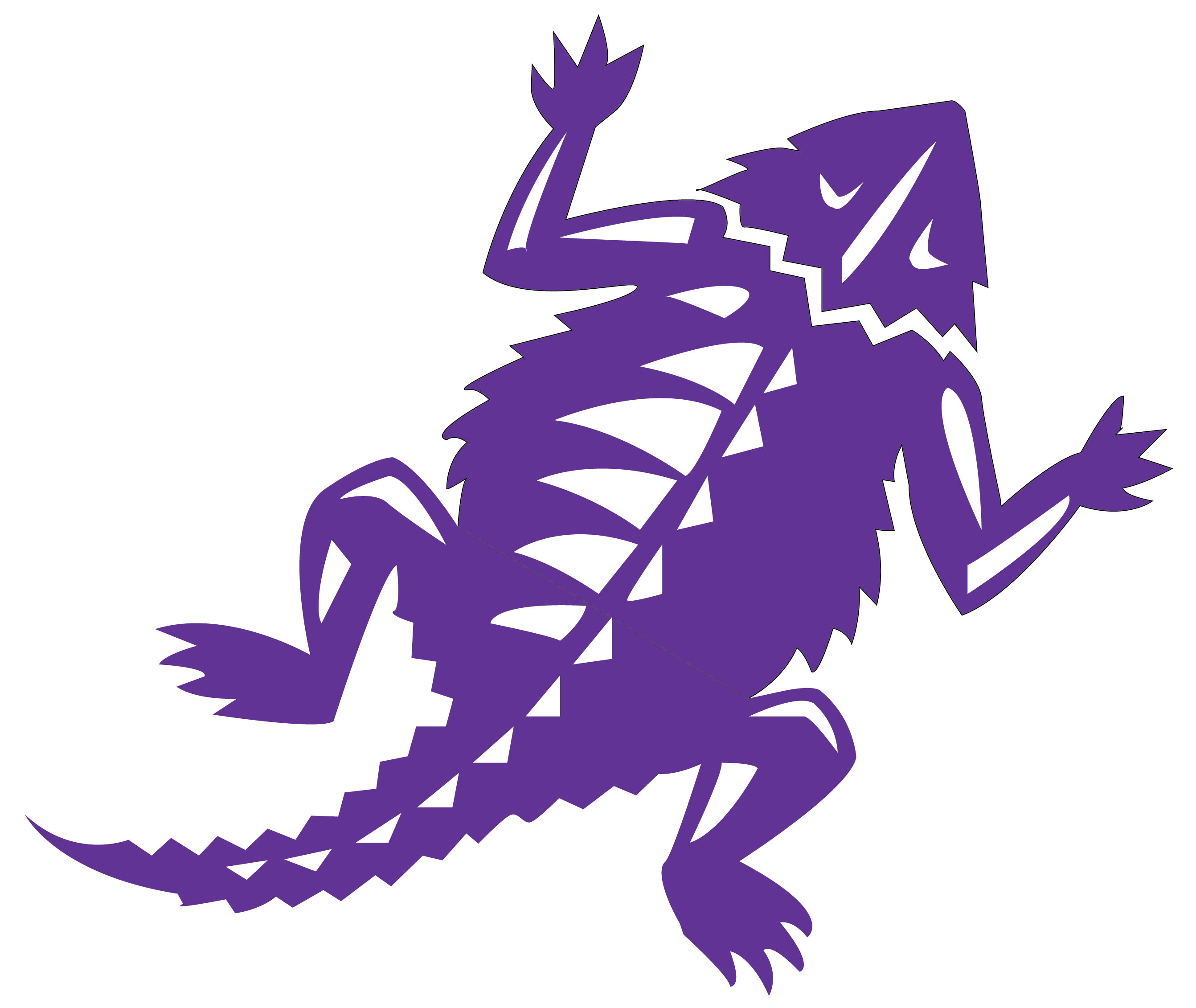
First, place an image of the Horned Frog Logo to trace. Change the image’s opacity to 50% and lock that layer.
Create a layer for the purple color and a layer for the white color so that the white overlaps the purple, and everything stays organized.
Use the pen tool to outline each part of the Horned Frog, ignoring the small white parts in the beginning. Once the purple outline is complete, move the the smaller white details.
Remember: drag and hold the pen tool to create curves.
Once the white details are drawn with the pen tool, color the purple by finding the “TCU color” by following these steps: “swatches” > “open swatch library” >”color books” > “PANTONE + solid coated” > type in “264.” Now you have the TCU purple!
Make sure the white layer is on top of the purple layer, and save as an dartboard. All done!
Start by making half of the vase using the pen tool: simply click and drag to make straight lines, and click and drag while holding down to create curved edges.
Always finish the shape by clicking the first point to close the edges.
Use the option key to temporarily delete the guiding lines in order to make a straight point connected to the previous curves point.
To complete the vase, copy and paste the half vase, then use the “rotate” > “flip” tool to mirror the other side of the vase. When this is done, use pathfinder and combine these two pieces.
Adding a gradient: go to the gradient tool and select a color swatch. Use the white box and black box to adjust the darkness and lightness of the gradient. Use the gradient on the tool bar to make the “bar” appear, which provides a visual of the angle and colors of the gradient in the shape.
Using the pen tool again, make the flower pedals by holding down the pen tool while dragging to make curved edges. The leaves are created the same way.
Change the opacity, overlap the flowers, and group them together.
Create the flower stems by dragging a long line with the pen tool and creating a small curve at the bottom, followed by another long line to connect the points. Send them to back, behind the vase.
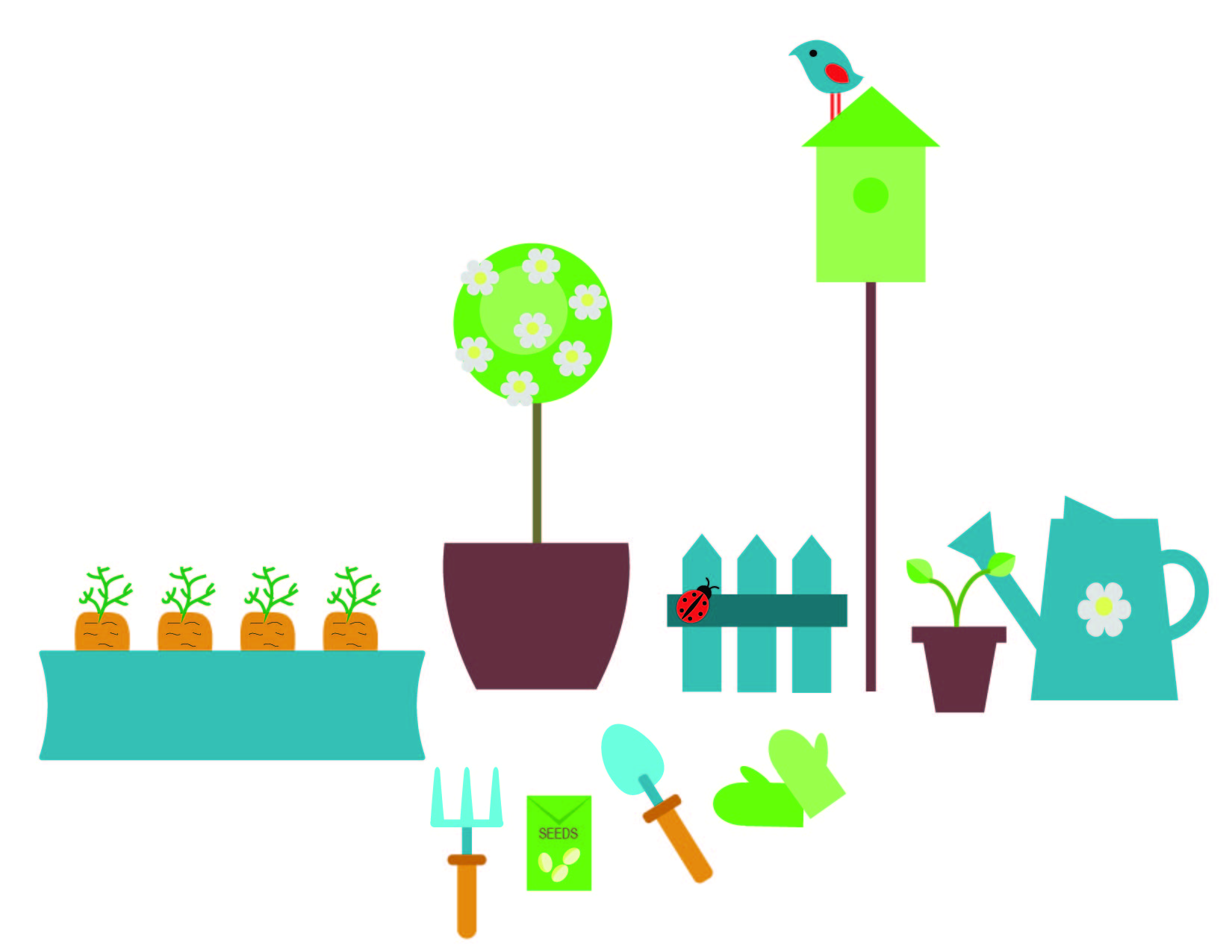
Since there are so many objects in this design, I will simply list out a few of the main tools I used to complete this garden scene.
To create objects that look more true to form, I used to the ellipse tool, then used the Direct Selection tool to drag anchor points to manipulate the corners of the objects (carrot, shovel, garden gloves).
The pencil tool was used to create lines (fill removed, black stroke, adjusted size of stroke) on the carrots.
To manipulate rectangles (carrot box, watering can, pots), I used to bulge tool (under effects –> warp), and made them concave or convex.
To make the flowers, I used the polygon tool and then added the effects of “distort and transform” and “pucker and bloat.”
The rectangle tool was used for many of the objects, either manipulated with the Direct Selection tool to make points (fence).
To make the bird, I started with the ellipse tool and the convert anchor point tool to make it look like an eye shape. The distort and transform “twist” effect made it into a bird shape.
In order to make sure colors were consistent, I used the eyedropper tool to select previously used colors and fill new shaped with them.
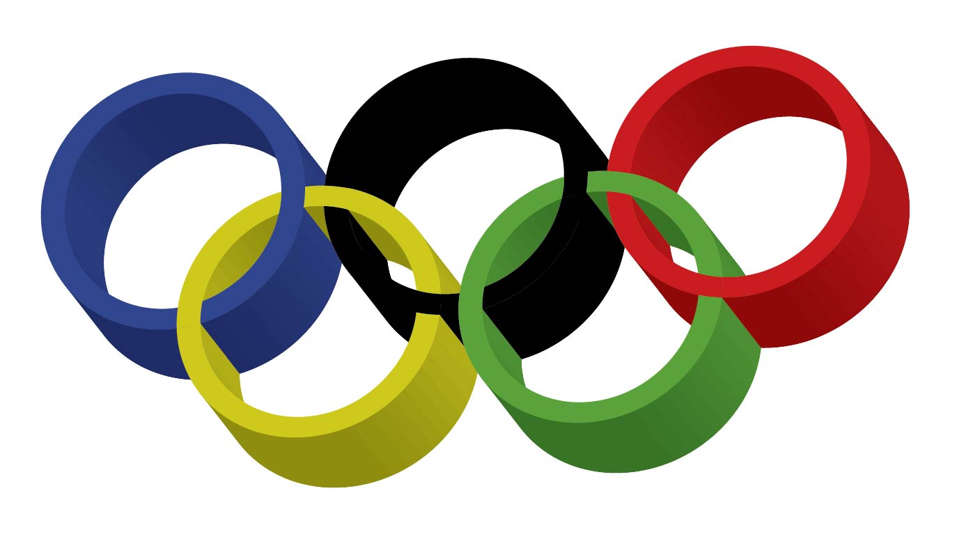
First, I embedded an image of the real olympic rings into a new 8.5 x 11 horizontal Illustrator board. This made it possible for me to create the new, identical olympic rings from scratch. In order to keep this design organized, I created and named two separate layers: one for the original olympic logo and one for my new design.
In order to keep the same colors as the original logo, I created swatches of each color by using the eye dropper tool and saving each color as a new swatch.
I created a single olympic ring by using the ellipse tool and matching it to the exact size of the ring on the image I embedded. Then I made a smaller inner circle by matching it up to the inside of the ring on the picture I embedded. I selected both rings, vertically and horizontally aligned them, and used the pathfinder tool to erase the middle. I then copy and pasted my new ring 5 times and placed each ring over the existing ring from the picture to create a new and identical logo.
I then used to the color swatches I created to color each ring to match the original image.
To color the pieces of the rings that overlap each other, I selected all of the rings, used the pathfinder, and used the “divide” command to separate the circles into segments. Once again, I used the saved color swatches colors the pieces to make them overlap each other. (Alt option: Use the Live Paint Bucket tool to color these pieces)
In order to make the rings 3D, I went to “Effect” and then 3D to play with the visual options.
Use the Artboard tool to select just the image you created and save it as a JPEG.
All done!
Extra note on saving files as a JPEG to upload: File, Export As…, JPEG, Select Use Artboards, Set Resolution to Medium, Save!