Photoshop Blog #3

What is it? Discuss the idea, and does it work.

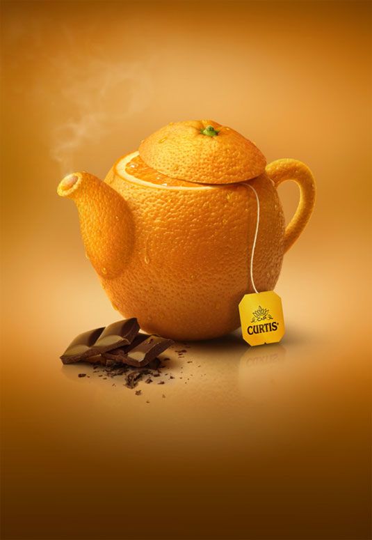
This is part of an ad series for Curtis Tea, which used different fruits in the shape of tea cups to represent the flavors of tea they sell. I think it is an effective ad because it is aesthetically pleasing, but it also conveys the direct message that the tea is fresh, natural, and flavorful.

What program do you think was used to create it?

I think Photoshop was used to create this ad because this image is obviously not real, but looks as if it is. They must have started with an image of an orange, which they then cut the top off of and re-positioned it to look like the top of a tea kettle. Then, they took images of the the spout and the handle of a tea kettle, loaded the selection, and masked in the texture of an orange. They also found an image of an orange slice and placed it directly in between the kettle and the lid, to make it appear as if the orange was cut open. They had to carefully place shadows within each part of the kettle, and drop shadows on the outside of them in order to make it look like the light source was coming from the same place. They probably did some blending in the “select and mask” window to make the edges of each object flow together naturally. They created the smoke with the “render” > “clouds” effect, and edited is to give the feel that it was rising upward. Finally, they reflected the image and lowered the opacity to create the reflection on the bottom.

What design elements do you see?

  • Unity: The image is basically all orange, which I wouldn’t usually choose to do, but in this case it creates a strong sense of identification with the overall message. It emphasizes the fruit and creates an aesthetic that resonates with the viewer.
  • Emphasis: Since this ad is so simple and there is only one focal point, it creates a large emphasis on the orange that doubles as the kettle, which is the overall message. There is so much precision in this design, which makes the simplistic quality more meaningful.

Photoshop Blog #2

What is it? Discuss the idea, and does it work.

This is an album cover create by an independent artist (it may just be a project, not even used for a real cover). Nevertheless, it caught my eye because of the color scheme and the interesting composition. I think it represents a vintage, unique artist, who sings with an indie influence.

What program do you think was used to create it?

I think Photoshop was used to create this ad because you can see how the separate elements were masked and combined together to create a new image. The artist was intentional about making the finished scene look somewhat choppy, in that it is not supposed to be accurate to real life. The girl, the different types of flowers, the mountains, the sky, and the globe were all masked and layered to create the nature scene. The color of the mountains has a distorted/inverted color effect. The girl’s coloring was changed to black and white with a grainy effect applied.

What design elements do you see?

  • Repetition: Many of the flowers are repeated, by taking the same type of flower and changing the size of the flower to create unity within the picture. There is also a repetition of the black triangles on the blue background, which get smaller to lead the eye up to the title of the album.
  • Symmetry: The image is very symmetrical, except for the asymmetry in the girls one arm holding her hair, which adds interest to the composition. The symmetry adds to the flow and naturalness of the scene, which is important when getting a message across.

Photoshop Blog #1

What is it? Discuss the idea, and does it work.

This is an advertisement for steak, which uses the idea of an animal carnivore to portray the high quality and competition for this brand of meat. The cheetah, who is a fierce predator, is wearing a jacket because he is about to enter the frozen food section. I think it works, but the cheetah is a little stiff-looking; it could have been designed to look more natural.

What program do you think was used to create it?

I think photoshop was used to create this ad because the jacket had to be placed on the cheetah in a way that looked real and natural. Since no one is in the position while wearing a jacket, some masking had to be done to separate the sleeves from the jacket. The artist must have re-placed the sleeves where the cheetahs arms and legs appear to be. Significant work was done on the shadows of the jacket so that it appeared to have the same light source as where the cheetah is positioned.

What design elements do you see?

  • Emphasis/Focal Point: The cheetah is the center of attention in this graphic. The ad is quite simple, but it adds emphasis to the main idea, which is that one of the biggest predators is going after the steak, so it must be good.
  • Contrast: The light background is contrasted by the dark type and dark cheetah/jacket. It directs the eye flow from the top to the bottom, therefore emphasizing the hierarchy of importance in information.

Sweet Shop and Bear Tables

Creating Tabs in InDesign

  • “Type” > “Tabs”
  • Line up Tab bar with the text, add markers (can either be left, right, or center justified) where you want the lines of text to align.
  • Add a leader (dotted line) in between tabs, as if creating a menu.
  • “Object” > ” Text frame options” > add more space on right, left, and top.
  • To make the red box and lines underneath the text, go to “Paragraph Styles” > “new” > “Paragraph Rules” > “below” > then change the color and adjust the offset of the box to align with the text.
  • Do the same for the lines, except just add a weight of .5 and adjust the offset so they are completely below the text.

Beatles Album Covers


Creating Tables in InDesign

  • “Table” > “Create Table”
  • In table settings, make a 3 column, 4 row table with 1 header and 1 footer.
  • Drag out the table to be 6 in by 6 in.
  • Always use the “Text” tool when adjusted tables. Tables can be selected, just like type is.
  • Select the top cells of the header and selected “Table” > “Merge Cells.” And do the same with the bottom row.
  • Drag the lines of the rows to adjust their sizes.
  • Add images by using “Command D” and make sure they are 2 inches. They can be resized by using “Object” > “Fitting.”
  • “Table” > “Cell options” > “align center” and fill text and cell with a color.
  • You can select all of the boxes and choose a font to make sure the same font goes in every box.
  • Center the text vertically by going to “Table” > “Cell options” > “Text.”

Color Brochure

Indesign

  • First, I created a 32 page InDesign document, and worked on the “Master Page” to create the elements that will be copied on each page of my brochure.
  • To automatically number the pages, I went to “Type” > “Insert Special Character” > “Markers” > “Current Page Number.” Then I typed an “A” on the master page, which allowed the following pages to be numbered properly.
  • If you want to have a page that doesn’t follow the master page, just drag the “none” page down to the desired page.
  • To edit individual pictures, go to the “links” tab and “open in photoshop” to edit them and have them directly import back into the InDesign page.
  • I created three Paragraph Style sheets by going to the “Paragraph Style” menu, adding a new sheet, and choosing the font preferences in the Basic Format tab. I created one for my headlines, one for my subheads, and one for my body text.
  • I saved it as a PDF file and “File” > “packaged,” which allows me to send a whole folder with the fonts, images, etc to whomever I need.

Mary Poppins Article

Magazine Spread with InDesign

  • First, I decided to format the article in two columns because it is the easiest to read that way. I made two text boxes, loaded the text, and placed it in the columns.
  • To add some cohesion and excitement to the spread, I made combined two circles and adjusted the opacity. I then added a text frame around the circle and increased the width of the white space around it.
  • I had to play with the size and width of the text boxes to make sure I didn’t have any widows or orphans on the ends of paragraphs.
  • I added lines on the top and bottom, as well as a blue stripe on the side to make it feel more professional and to add attention to the article.
  • I created a drop cap in the paragraph style menu, and had to experiment with different fonts I order to create the best visual.
  • Lastly, I made sure to use a serif text and create a character style, in the case that I wanted to use it again.

Snowboard California

Magazine Layout with InDesign

  • Page Set up 8.5 x 11 with .25 margins.
  • Add a horizontal guide (from rulers) 1 inch from the top by dragging down from the rule on the top and on the left.
  • Add outer lines along margin guides with the line tool by dragging and copying & pasting.
  • Add bottom blue bar that bleeds off the edges of the paper. Important to make it bleed for printing purposes.
  • Adding images file place resize using bounding box or go to object fitting. “Command – Shift” is used to make the whole image bigger, not just the bounding box. “Command – Shift – Option” allows you to drag the object to make it larger from the middle, not the corners. A helpful tool to fit the image to the bounding box is “Fitting – Fit Content Proportionally.”
  • Add Large image – file / place 0830029. The keyboard command to place an image is Command D.”
  • We want to have just the hand outlined so we are going to use 2 images on top of one another. Copy the image. Select the image on which I have already made a clipping path in photoshop. Object/ clipping path / options / photoshop clipping path. It is now outlined. Now paste the original image exactly on top edit / place in place. Take the top image and pull down the top bounding box so the hand is outlines then up on the bottom. Marque the 2 images, object / group. Then deselect
  • Add red man 43_2527521
  • Resize, tile and add drop shadow. 50% and move the shadow angle, but going to “Object – Effects – Drop Shadow.”
  • Add blue man 0830027
  • Resize, tile and add drop shadow. I placed this image by using the rectangle frame tool and clicking within it with the photo loaded
  • Make 3 character style sheets by going to “Window Styles – Create New.” If a row of text is highlighted, it will automatically form a new style. You can also do this manually when creating a new style by doubling clicking on “Character Style 1” and choosing options in the menu.
  • Headline – Myrad Pro Condensed 48 pt.
  • Subhead – Myrad Pro Condensed Bold 12 pt.
  • Body – Times 10 pt…Add columns to the text by using the columns arrows in the top tool bar.
  • Sidebars: created with rectangular boxes
  • Gradients: a gradient was added with the gradient panel and a new swatch the we created in the swatch panel.
  • Rounded edges – “Object – Corner Options.”
  • Add type using character styles. Just highlight type and click on the character type you created before.
  • Text Wrap, under blue man there is a text wrap. Then you need to not have the text wrap on the fact file in sidebar object / text frame options / ignore text wrap.

Type Tutorial

Type Tutorial for Photoshop

Website: http://designrfix.com/resources/text-effect

  • Create a new photoshop document — the first effects will be added to the background layer.
  • Menu > Layer > Layer > Layer Style > Blending Options
  • Within this menu, I manipulated the blend modes, angles, opacities, etc. of the Inner Shadow, Inner Glow, Gradient Overlay, Pattern Overlay.
  • I downloaded the font “Nautigal” from DaFont and added it into Photoshop by going to the Font Book application and clicking “add font” in the menu bar. Then I typed my name in the middle of the page.
  • Once on the text layer, go to Menu > Layer > Layer Style > Blending Options.
  • I adjusted the settings for General Blending, Drop Shadow, and Bevel and Emboss to take the color out from within, create a nice white highlight to the letters, and add a shadow around the letter so the word kept its form.
  • To further customize this text and make it appear as though it is sitting in the paper, I duplicated the text layer and added adjustments directly on top of the first text layer.
  • I cleared the layer style in the duplicate layer by going to Menu > Layer Style > Clear Layer.
  • Then, I added adjustments to the type by using the general blending, inner shadow, and bevel and emboss tools to get the darker outside of the letters.
  • Lastly, I adjusted the drop shadow and stroke to get the final product!

Jess Day #2

No Merchandising. Editorial Use Only. No Book Cover Usage Mandatory Credit: Photo by Moviestore/REX/Shutterstock (2295319a) NEW GIRL (TV) (2011) Zooey Deschanel 001 New Girl – 2011

Applying Clipping Mask Layer to Text in Photoshop

  • First, I cut out the image of Jess using the direct selection tool; this deleted the background.
  • Then, I added a normal text box around the whole square frame and typed text in the whole area.
  • Then, I dragged the clipping mask of Jess up to the text layer, while holding the OPTION key (this is important because it keeps the mask on the original layer and just copies it). This made the text fit inside of Jess’s mask.
  • Lastly, I made a new layer for the gradient and moved it to the background.