What is it? Discuss the idea, and does it work.
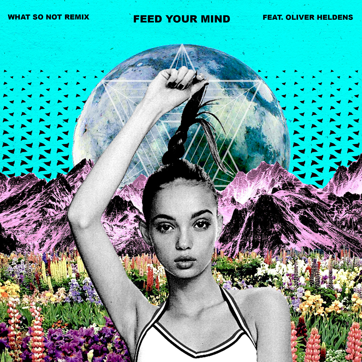
This is an album cover create by an independent artist (it may just be a project, not even used for a real cover). Nevertheless, it caught my eye because of the color scheme and the interesting composition. I think it represents a vintage, unique artist, who sings with an indie influence.
What program do you think was used to create it?
I think Photoshop was used to create this ad because you can see how the separate elements were masked and combined together to create a new image. The artist was intentional about making the finished scene look somewhat choppy, in that it is not supposed to be accurate to real life. The girl, the different types of flowers, the mountains, the sky, and the globe were all masked and layered to create the nature scene. The color of the mountains has a distorted/inverted color effect. The girl’s coloring was changed to black and white with a grainy effect applied.
What design elements do you see?
- Repetition: Many of the flowers are repeated, by taking the same type of flower and changing the size of the flower to create unity within the picture. There is also a repetition of the black triangles on the blue background, which get smaller to lead the eye up to the title of the album.
- Symmetry: The image is very symmetrical, except for the asymmetry in the girls one arm holding her hair, which adds interest to the composition. The symmetry adds to the flow and naturalness of the scene, which is important when getting a message across.