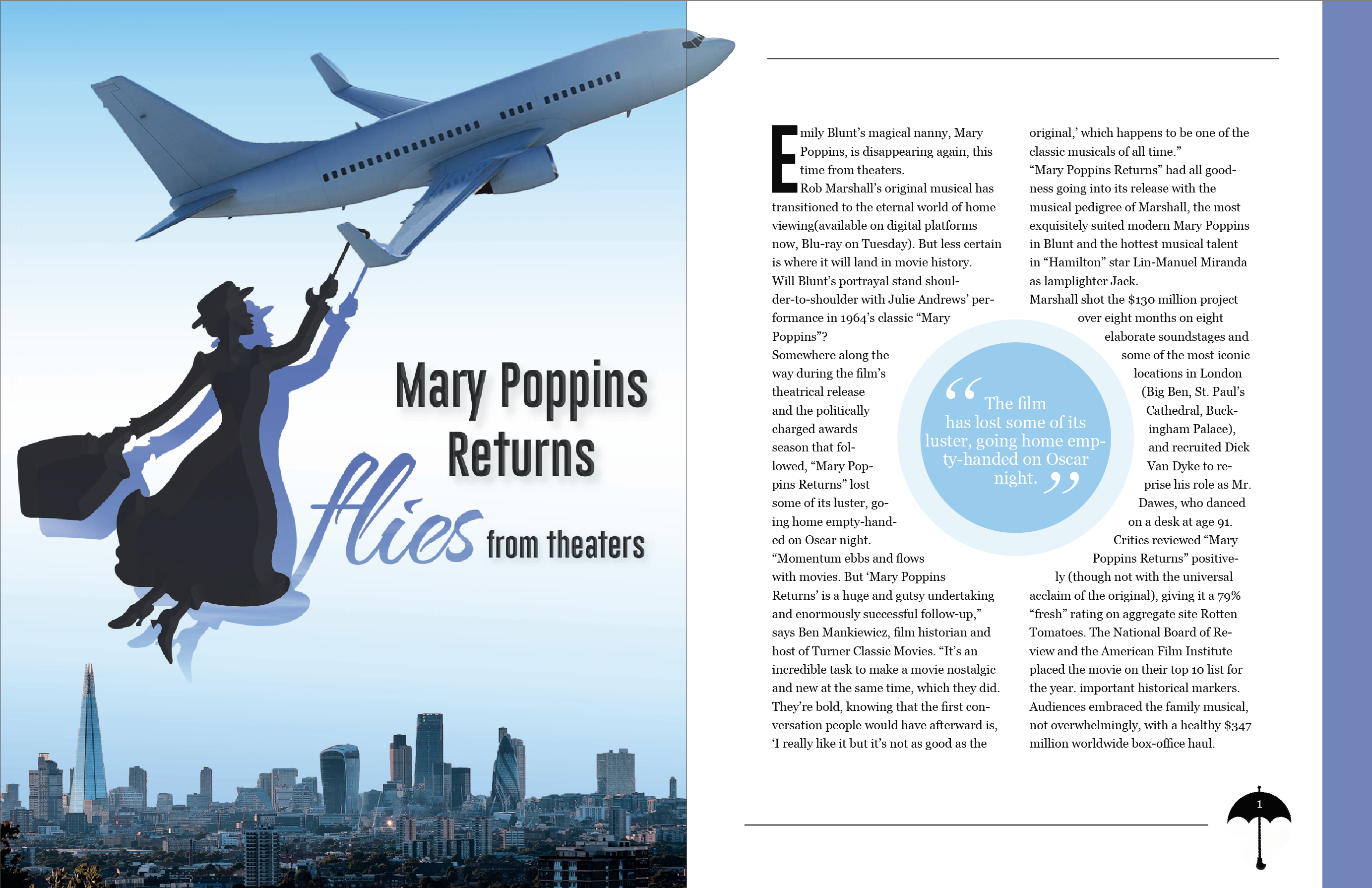
Magazine Spread with InDesign
- First, I decided to format the article in two columns because it is the easiest to read that way. I made two text boxes, loaded the text, and placed it in the columns.
- To add some cohesion and excitement to the spread, I made combined two circles and adjusted the opacity. I then added a text frame around the circle and increased the width of the white space around it.
- I had to play with the size and width of the text boxes to make sure I didn’t have any widows or orphans on the ends of paragraphs.
- I added lines on the top and bottom, as well as a blue stripe on the side to make it feel more professional and to add attention to the article.
- I created a drop cap in the paragraph style menu, and had to experiment with different fonts I order to create the best visual.
- Lastly, I made sure to use a serif text and create a character style, in the case that I wanted to use it again.