What is it?
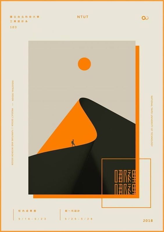
This poster is titled “Walking Towards the Mountatintop” and I found it on a website used to provide graphic designers with inspiration for different posters and projects. It acts as an example of an industrial design poster. The mountain is formed out of paper and it features a small man trekking upward to reach the sun.
What program was used to create it?
I think Illustrator was used to create this poster because it appears to have been made with vector graphics. The pen tool and ellipse tool are the main players in this piece, as well as the rectangle tool that was used to create the bounding boxes. But, the tools responsible for creating the illusion that the piece of “paper” is an actual mountain is the drop shadow tool. The gradient swatch tool might have also been used on the right side of the paper where it curves, in order to make it appear three dimensional.
What design elements were used?
This piece makes a good use of contrast. It is mostly composed of neutral colors, such as shades of grey and black, but the orange adds a contrast that makes the piece more interesting. Without the orange, it would not appear as 3D and it would not appeal to the viewer. There is also a strong sense of movement in this piece. The artist draws the viewer’s eye from the bottom to the top, which is done through the curve of the line and the focal point of the sun, which matches the bright orange of the mountain. Lastly, there is symmetry in this piece, in the case of the rectangles, which is perfect for an industrial magazine.
